In my free time I enjoy developing game concepts for paper and pencil RPGs. This is where I post things I create, or ideas I want to share.
A Matter of Perspective
So I have been playing around with the one of the comments that James Wyatt, Ray Winninger, and others have said about the creation of a campaign world. Basically, that pearl of wisdom is "don't bury your players with needless information." In other words, even though the world building itch motivates many DMs to create lavish 20,000 years of history for their world, along with 15 nations, and epic songs and other legends to populate the world- that urge should be resisted. The reasoning is 1) you will burn out before the first game session can happen, and 2) the players will be overwhelmed and get bored.
In UX this is sometimes called the "wall of noise". where users are confronted with a web page full of information, but it is all given equal weight. That kind of appeals to modernist, Bauhausian design aesthetics (everything is a modular part on the page) but it becomes an overly rhythmic interface for the user— there is no useful irregularities for them to see a hierarchy of importance. And designers are not only supposed to be making a nice looking page, but also guide the user to the most important things.
When a designer is crating a landing page for users who may lack any fore knowledge on the subject, it is good design to make it asymmetrical and kind of lumpy- with the things you want them to do by default all up in their face, and the less important stuff kind of squished into the background.
In Windows, Microsoft encountered a wall of noise problem. User testing showed that new computer users were flummoxed by the windows 3.1 desktop, and didn't know which of the similar drop downs at the top of held the important to them tools. The designers had just assumed people knew how to dive in and use this tool they had built. But when they realized the problem, their solution was to put a big fat Start Button in the lower left corner of the screen in Windows 95.
Back to world building, the basic idea suggested by the experts is for the DM to detail the party's starting area in detail, and then get progressive more vague outside of the town. This lets the players understand what they should be worrying about, and not get them worked up about the cool kingdom over the impassible mountains, until they are ready to go over there. Sort of a Bullseye of information centered on the tavern where the players get their quests.
That got me thinking about how to provide the party with their maps. The most logical approach would be to put some tissue paper over the world map, and draw a set of concentric circles around the starting town, and then draw in map details, with each ring getting more vague and sketchy, until outside the largest ring it would simply be "here there be monsters" or terra incognita.
Which I suppose it would be a good mental model for a party of peasants who had never left their hamlet. But its pretty rare that you get a group of players willing to start their characters off at such mundane level. Players want to start off with cool world wise characters, who have ended up coming to the town, like the Seven Samurai, to sort out the local problems. So it is not fitting to be with holding information form the players, when their characters would probably know more.
So the thing I have been playing around with is perspective maps. It is closer to the mental model we humans have when thinking spatially, and is more a reflection of where we are, and how we see the world around us.
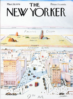
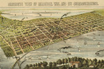
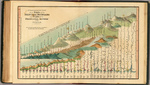
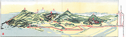
Some classic examples
So playing around with the default setting in the Dungeon Master's Guide, and Google Sketchup, I made a low quality 3D version of Mike Schley'svery cool map of the Nentir Vale. (which I am using here without permission.) The idea of this experiment is to show to the players how their characters would see the Nentir Vale mentally from their home base in Fallcrest.
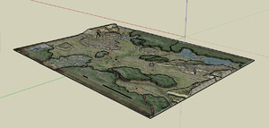 The 3D map
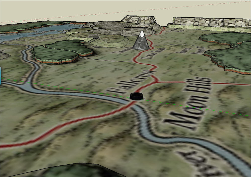 Looking North East
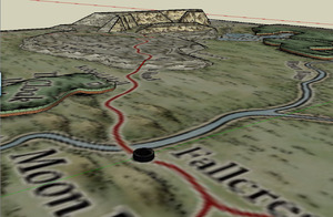 Looking North West
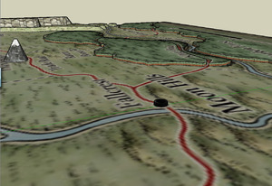 Looking South East
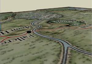 Looking South West
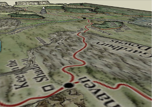 The view looking back at Fallcrest from Winterhaven
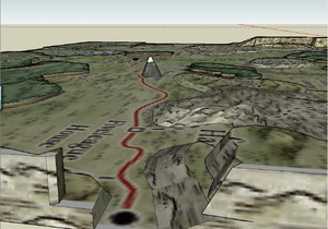 ...and the view looking back from Hammerfast
Now this perspective is hovering about 12 miles in the air, but everything in the map is exaggerated. (the forests are about a mile tall, and Thunderspire is about the height of Mount Everest, if this was all to scale.)
Probably it would be better to offer the players a 360 Quicktime VR type online tool, where they could look around the Nentir Vale from Fallcrest, and get a real feel for their environment. And then by the nature of their perceived proximity, they are able to understand the things they should be focusing on.
Subway Map to the Stars
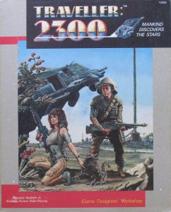 In 1986 in Dragon Magazine I saw an advertisement for a new space game called Traveller 2300. I was hooked immediately- I had messed around with Traveller, the High Space Opera RPG that had been for around for a few years, but since I had little experience with classic space opera it was more of a curiosity. But a hard Scifi space RPG was much more up my alley.
I was really into it for a few years, but could never get a game off the ground. partially because this was a period of fracturing in the RPG scene (everyone was coming out with a new game setting and rules set- so it was hard to find 4 people who were all investing in the same game. But also, sadly the rules for Traveller 2300 were beyond me.
But one important thing was that the game was set in a fairly factual universe. They had taken real and current data about the stars within a 50 LY radius of the solar system, and used that as the basis for the game universe. They had figured out 300 years of future history, colonial expansion from earth, wars, trade routes, and even points in space where humans contacted alien neighbors- all in a spherical chunk of space with earth at the center.
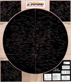 (one thing that had had baffled me about the original Traveller game was that all of the star maps, were basically hex maps with a black background, and filled with hundreds of stars, only a fraction of which they detailed. This worked functionally, and offered referees plenty of space for their campaigns... But space is not a 2 dimensional plane, so the maps really kind of bugged me. I think I chalked it up the same sort of scifi blind spots, like movies with noises happening in the vacuum of space, or aliens who all speak English.)So seeing
the poster map that came with the boxed set of Traveller 2300 with its explanation of the 3D space it was showing was probably my favorite thing about the game.
It showed a 'top down' view of the 'sphere of space', and then explained the formula of how to find the distance between any two stars. All the star's names were shown, and then also their position in the main sequence was indicated by their dot color.
To show how "deep" each star was in the map, each star's dot size would vary to indicate its Z axis position. (the bigger the dot the closer the star was to the viewer).
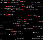 So the first issue with this map was the confusion between the size of the dot verses the size of the star. since they were using the color of the dot to indicate the color of the star, then it seems intuitive that the size of the dot indicated the size of the star, not its 'distance' from the viewer. Perhaps if the background behind the stars had shown a curve of the inside of a holograph sphere, it might have helped.
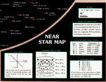
The Key was not much help. It gave the formula for calculating the distance between stars, but the dot size only indicated an approximatedistance range of 20 LY, which is not very precise. (they gave the exact positions in a booklet, but that reinforced the idea that this was more of a decorative map then a functional one.
Beyond that, there was the fact that the setting had an imposed rule that no ship could safely go more then 7.7 LY before the crew got a lethal dose of radiation. This was a side effect of the game's FTL Stutterwarp drive. What this meant was that ships could only travel in short jumps, and then spend a few days in orbit around a gravitational body discharging the dangerous radiation.
So it was pretty much impossible for a character to travel directly between 2 stars, but instead they followed established routes between stars of the required distance or less. These were grouped into 'arms' and 'branches' and were named after the political powers that had colonized them the most.
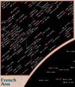 The other three corners of the map showed each of the main arms, on a version of the map, with lines drawn between the systems, to indicate which stars were connected to what other stars to form that segment of the arm.
This was still from the 'top down' view of the sphere of space, so the segments of the routes were visually squashed. Also, each of the arms was shown on its own, so there was no easy way to see where one arm connected with another arm, or how close a particular star was to the edge of the sphere of known space.
So as you can see I was presented with an interesting geography, but it was being shown to me in a rather frustrating format. Of course, depicting 3D geography on a 2D surface is always a challenge- just look at the distortions one adapts to on the various projection system for maps of the earth's surface onto a flat map.
But I still focused on trying to solve it- my first realization was a map could not solve every situation's needs. There was always a compromised of some sort, because a flat map can't hold all the information of a 3D space in a visually intuitive way.
So I eventually decided what I really was looking for from the map was a tool to help my player's caption character be able to navigate through this universe. He needed to know where he could go when he was anywhere on the map in a simple manner.
I then began working on bubble chart type maps, trying to reduce it down to simple decisions. When at star X, where can I go (what other systems are within range) how far is each, and what lies beyond them. I eventually began drawing what I now call "subway" maps. Growing up in the midwest I had never ridden a subway, or probably even seen a subway map before. (and it would be years before I had heard of Harry Beck.) But I simply refined the options of this massive if useless star map down to a simple chart answering the question of "where can I go?" (If I find any of these in my boxes of old documents, I'll try to get a scan of them up here.)
I never really found a solution I was happy with. (the subway map worked very well, but upon reflection, I felt it took away some of the 'scifi' feeling of navigating among the stars. There was something to the action of calculating your location, and flying your ship true to a line that would take you to your destination. Part of the feel of the game was his kind of mechanical and gritty feel to space.
That was when I got to thinking about angles, and how a starship navigator would have to know how to orient their ship to where they want to go- before engaging the ships engines. And the old XYZ coordinates were not really useful for that. They were useful for someone one the Outside looking at where each object in the coordinate system was located in relation to the origin. But if I am on a ship out somewhere in deep space, what I would really want to know was where the other stars were in relation to me- I would need to find a point of reference (the center of the Milky Way I figured) and then know how many degrees latitude and longitudinally from that point I need to turn the ship to be pointed at where I wanted to go.
So I envisioned a 2D map that was a circle, and the ship would be at the center. then the circle was marked in degrees, with 0 degrees being pointed at the galaxy center. so that would handle the 'longitude', and their 'latitude' above of below the plane could be indicated by degrees inclination of declination. The main advantage of this map system was that 1) it looked very cool, and sci-fi. and 2) looking at the map the distance from the center to any of the other stars shown was its true distance- you could see visually which one was the closest to you without any math.
The disadvantage was each point in space would need to have a unique map- it's was specific to the ships current location. But ignoring that (for the game's purposes, you would really only need a map for each star system a ship might visit- a lot of work, but not insurmountable.)
I remember telling my dad about this, with the excitement of someone who had made a profound discovery. He replied "Son, you just reinvented the Polar Coordinates system." Ah.
But reading up on it, (and discovering that they made polar coordinate graph paper) helped me out a lot, and so I went ahead and drew up a set of charts for the various worlds on the various arms. I think I still have that binder somewhere- this after I had stopped playing any RPGs at all, and certainly not 2300AD. (they changed the name when the game was rereleased, mostly because it had nothing to do with the old Traveller system.)
When I was in design school, working on a thesis project, I knew I wanted to do something in Director, (this was back when Flash was just used for spiffy animations- director had the serious interactivity scripting language.) and I dusted off this old map problem. I had done all the maps, and figured out the calculations- even building an excel tool, to allow me to make the angular calculations for every star system. I did my these project on creating a clickable map tool- where someone could see each map rendered for any star system, and click to jump to the next, and the next after that, and so on.
The upshot of all of this, was that I eventually ended up working in the field of IxD via my interactivity work, which in turn was to no small part due to my drive to solve information problems like this and others that I encountered in RPGs. Plus I think I have a new, even better idea on how to tackle this star chart...