So I have been playing around with the one of the comments that James Wyatt, Ray Winninger, and others have said about the creation of a campaign world. Basically, that pearl of wisdom is "don't bury your players with needless information." In other words, even though the world building itch motivates many DMs to create lavish 20,000 years of history for their world, along with 15 nations, and epic songs and other legends to populate the world- that urge should be resisted. The reasoning is 1) you will burn out before the first game session can happen, and 2) the players will be overwhelmed and get bored.
In UX this is sometimes called the "wall of noise". where users are confronted with a web page full of information, but it is all given equal weight. That kind of appeals to modernist, Bauhausian design aesthetics (everything is a modular part on the page) but it becomes an overly rhythmic interface for the user— there is no useful irregularities for them to see a hierarchy of importance. And designers are not only supposed to be making a nice looking page, but also guide the user to the most important things.
When a designer is crating a landing page for users who may lack any fore knowledge on the subject, it is good design to make it asymmetrical and kind of lumpy- with the things you want them to do by default all up in their face, and the less important stuff kind of squished into the background.
In Windows, Microsoft encountered a wall of noise problem. User testing showed that new computer users were flummoxed by the windows 3.1 desktop, and didn't know which of the similar drop downs at the top of held the important to them tools. The designers had just assumed people knew how to dive in and use this tool they had built. But when they realized the problem, their solution was to put a big fat Start Button in the lower left corner of the screen in Windows 95.
Back to world building, the basic idea suggested by the experts is for the DM to detail the party's starting area in detail, and then get progressive more vague outside of the town. This lets the players understand what they should be worrying about, and not get them worked up about the cool kingdom over the impassible mountains, until they are ready to go over there. Sort of a Bullseye of information centered on the tavern where the players get their quests.
That got me thinking about how to provide the party with their maps. The most logical approach would be to put some tissue paper over the world map, and draw a set of concentric circles around the starting town, and then draw in map details, with each ring getting more vague and sketchy, until outside the largest ring it would simply be "here there be monsters" or terra incognita.
Which I suppose it would be a good mental model for a party of peasants who had never left their hamlet. But its pretty rare that you get a group of players willing to start their characters off at such mundane level. Players want to start off with cool world wise characters, who have ended up coming to the town, like the Seven Samurai, to sort out the local problems. So it is not fitting to be with holding information form the players, when their characters would probably know more.
So the thing I have been playing around with is perspective maps. It is closer to the mental model we humans have when thinking spatially, and is more a reflection of where we are, and how we see the world around us.
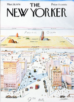
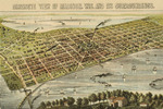
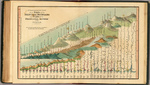
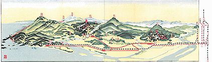
Some classic examples
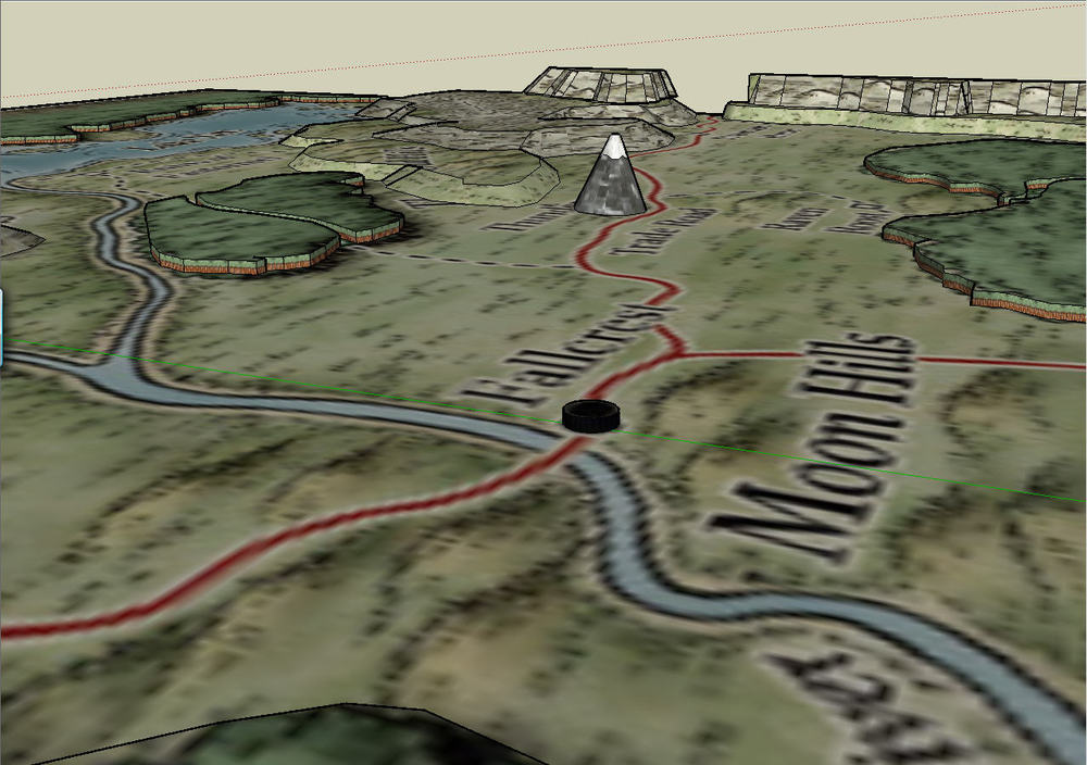
So playing around with the default setting in the Dungeon Master's Guide, and Google Sketchup, I made a low quality 3D version of Mike Schley'svery cool map of the Nentir Vale. (which I am using here without permission.) The idea of this experiment is to show to the players how their characters would see the Nentir Vale mentally from their home base in Fallcrest.
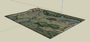 The 3D map
 Looking North East
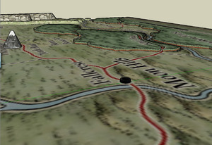
 Looking North West
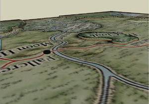
 Looking South East
 Looking South West
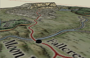
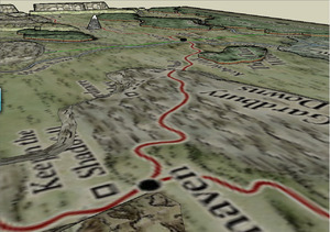 The view looking back at Fallcrest from Winterhaven
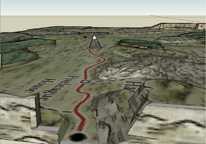 ...and the view looking back from Hammerfast
Now this perspective is hovering about 12 miles in the air, but everything in the map is exaggerated. (the forests are about a mile tall, and Thunderspire is about the height of Mount Everest, if this was all to scale.)
Probably it would be better to offer the players a 360 Quicktime VR type online tool, where they could look around the Nentir Vale from Fallcrest, and get a real feel for their environment. And then by the nature of their perceived proximity, they are able to understand the things they should be focusing on.